How many slides do you need? Lessons from Top 7 TED Speakers
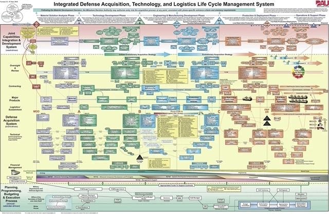
the famous slide from the Pentagon - “When we understand this slide we’ll have won the war “- General Stanley McChrystal,
You probably get all sorts of answers and lots of advice when you ask your colleagues how many slides should you use.
So I thought why not see what the top seven ted speakers tell us about that question. Of course they are doing keynotes rather than a standard company presentation but these people have spent a lot of time thinking about their presentation.
I watched the top 7 Ted talks this morning and did some simple counting. You might be surprised at the answer. So here is the basic research followed by some conclusions
The research
Ken Robinson who is top with 57 million views, he has no slides. Yes, no slides. You don’t have to have slides to have a compelling presentation. Ken’s talk is like a chat. A very funny, focussed chat.
Simon Sinek, is third most watched speaker with 43 million views again with no slides, simply writes on two flip chart pages. Simon builds his ideas of “Start with the why” by using a big pen and a large bit of paper. It’s compelling
Amy Cuddy’s talk, with the second most viewed with 52 million views and she does use 42 slides. Twenty of those slides have NO words – just pictures. In fact, she only has 91 words in total. The most words on a slide was 14 words. She is near tears at 18 minutes and ends with a standing ovation
So far, I’ve watched an hour’s worth of presentations with no bullet points. Hurray. And only 42 slides in total
Coming in at 4th, Brené Brown,with 39 million views. She uses only 25 slides with ten of them with NO words. 53 words spread over the 15 slides with eight words been the most wordy slide. It’s a presentation full of stories and fabulous insights for anyone interested in how we handle shame and vulnerability. It comes up a lot for me when I work with people and public speaking
The fifth talk, has climbed to this position because it’s about sex. Nothing wrong with that of course. Sex helped me get here on earth! Mary Roach’s “10 things you didn’t know about orgasm” with 26.9 million views. Who knew that you could have an orgasm from your knee? It’s a more basic talk than some of the others,using a simple 1-10 structure. Only 13 slides, two slides with no words, 55 words in total. The most wordy slide has just nine words!
Julian Treasure’s “How to speak so that people want to listen”.
33 million views, 15 slides in total, nine slides without words and 53 words in total. Julian has the most wordy slide out of all seven talks. A massive 16 words on one slide!
The final talk of the morning, Jill Bolte Taylor and finishes 123 minutes of presentations of watching. 23.5 million views. Just 8 slides, three slides without words. But she brings out a real brain. She’s only person to use a real thing as part of her visuals. And the audience groans. Total 25 words on all of those slides and the slide with the most words has five words on it.
So just some quick thoughts
They are keeping the slides really simple.
Slides do not equal the presentation, the slides support the presenter
The best slides are just one idea per slide
Lots of slides are without words
Pictures are better than words
Stories are really important
The presenters are concentrating on connection with the audience and building their ideas in the audience minds.
You don’t have to use slides at all, two of the best speakers don’t use them at all.
Personal pictures connect you with the speaker more. Jill Bolte Taylor's picture of her brother with a mental illness brings it home.
Real things have drama. So think about using something real instead The actual brain that Jill brought onto the stage had massive impact.
Even when slides have words, there are often just one or two words on them. The presenters don't overfill the slide. (this point has more words than the most wordy slide)
It takes discipline to plan a presentation well!
No bullet points or big lists. Unlike this article. Sorry about that...
I'd love to know what are your thoughts are?

